Election night is the “Super Bowl” of news. It is high stakes, fast moving, and unfolding in real time.
Every election presents its own challenge for broadcasters.
In Sweden, broadcasters have to make sense of a multi-party system where coalitions determine who can form a government. In the United States, results arrive from thousands of districts over hours and sometimes days. Both need to take an enormous amount of live election data and make it understandable to audiences, all while the outcome is still taking shape.
For more than 25 years, our team at InterKnowlogy has been building interactive broadcast technology to help make sense of these moments. Throughout that time, we've watched both the volume of live election data and the tools available to work with it grow enormously.
Broadcasters can now bring together live results, historical comparisons, polling, demographic information, geographic detail, and scenario modeling. But having more data doesn't necessarily make an election easier to explain.
Without context and insight, vote totals alone don't tell viewers why a lead changed, which districts are still outstanding, how the latest results compare with previous elections, or what needs to happen for a party to form a government.
Election results don't arrive all at once, which means the latest number rarely tells the whole story.
In Sweden, individual party results are only part of the outcome. Viewers also need to understand which parties could form a coalition and how a shift of just a few seats changes the path to government.
In the United States, states, counties, and districts report on different timelines. A candidate may appear to be ahead before important districts have reported, and mail-in ballots can continue to change the result over the following days.
This changes what correspondents need from their technology. Showing the latest count is relatively straightforward. Explaining why it changed requires the ability to explore the data behind it.
A correspondent might want to move from a national result into the districts driving a change, compare the current count with an earlier point in the evening, or explore what a new seat distribution means for a potential government.
Those questions aren't always known before the broadcast starts. Presenters need tools that let them investigate the data live as the story develops.
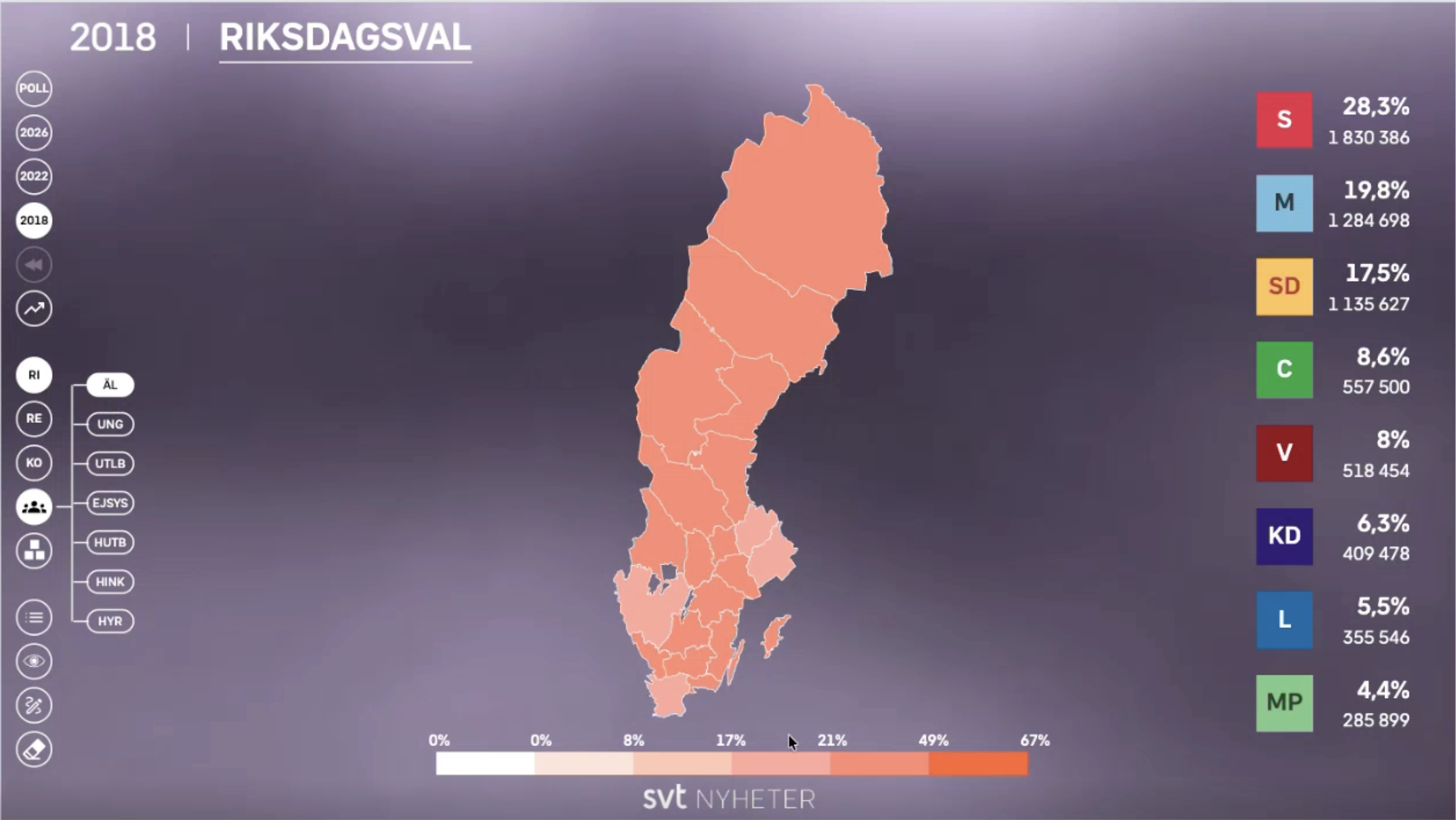
We saw this firsthand while working with Sveriges Television (SVT) on Sweden's 2022 election.
Three elections were taking place simultaneously across the Riksdag, regional governments, and municipalities. More than 6,000 districts were reporting results every few seconds, with data available at national, regional, municipal, and district levels.
SVT needed to bring live results, geographic data, exit polling, demographics, and coalition scenarios into one experience that presenter Fouad Youcefi could navigate naturally on air.
One of the tools we built was Build a Government, designed specifically around Sweden's parliamentary system. Fouad could drag and drop parties on screen and immediately explore what different combinations meant for forming a government.
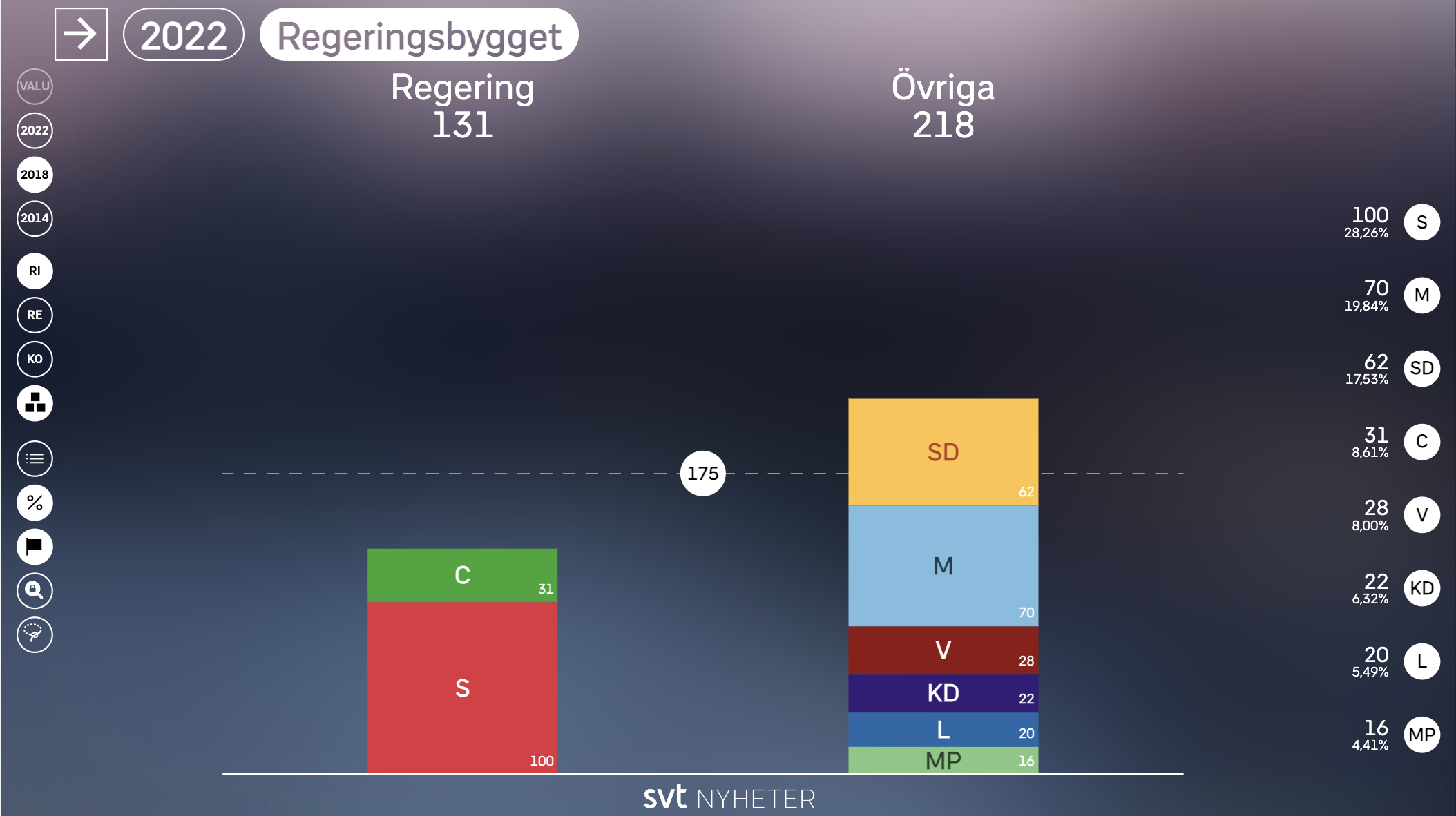
SVT also integrated its VALU exit-poll data, adding demographic information to the geographic view of the results. This gave Fouad another way to investigate voting patterns across different parts of the country.
The goal wasn't to put more election data on screen. It was to give Fouad the ability to investigate that data live.
He could follow a change in the results, move into the districts behind it, or test a potential coalition as the question came up on air. Instead of having the technology dictate where the presentation went next, he could follow the story.
His work ultimately earned him the nickname “Svensk John King” among Swedish viewers.
Interested in providing an election broadcast experience like SVT? Schedule a demo of IK Election Insights.
What worked for SVT can't simply be copied into another country's election coverage. The useful part is the approach behind it: start with the election, the available data, and the questions the newsroom needs to answer.
In Sweden, one of the biggest questions is which parties can form a government. In a U.S. midterm, the question may be which outstanding congressional races create a path to control of the House.
The underlying need is similar, but the data and the way a correspondent needs to explore it are different.
IK Election Insights is designed around that reality. The platform can bring together real-time data aggregation, geographic drill-down, comparative analysis, scenario modeling, telestration, and presenter-led exploration based on the election being covered.
That flexibility also affects how the rest of the newsroom works. Producers can prepare for the stories they expect to cover without being locked into them once results start coming in. If an unexpected district becomes important, the correspondent can explore it without waiting for an entirely new sequence of graphics to be built.
For broadcast operations, the challenge sits behind all of that. Multiple data sources need to be ingested, processed, and kept current while the editorial direction continues to change.
All of that exploration depends on what is happening behind the screen.
On election night, thousands of results may be updating while correspondents are actively working with the data on air. The platform has to process those changes and make them available without adding another point of friction for the newsroom.
IK Election Insights is built on Microsoft Azure as a cloud-native platform, with no on-site hardware for a broadcaster to maintain and built-in redundancy that supports the reliability required for live production.
Security is part of that requirement. Election coverage involves sensitive, real-time information, and the systems supporting the broadcast need to remain protected while results are moving quickly. Cloud infrastructure allows security updates and patches to be managed centrally while providing the availability and redundancy expected in a live production environment.
For the newsroom, much of this should be invisible. Correspondents and producers should be focused on the election, not whether the infrastructure can keep up with it.
The upcoming U.S. midterms provide a good example of how the same approach can be applied to a very different electoral system.
Close races can remain unresolved for 48 to 72 hours as ballots are counted across different jurisdictions. During that time, a lead may change as different counties report or mail-in ballots are added. At the same time, control of the House or Senate may depend on a relatively small number of outstanding contests.
Consider a swing district where the lead changes the morning after election night.
Showing the new vote total tells viewers who is ahead. It doesn't explain how the race got there.
Election Insights’ Time Travel feature could allow a correspondent to move back through the district's reporting timeline and show how the result changed as additional ballots were counted. Rather than comparing yesterday's number with today's, viewers could see the trajectory of the race and when the gap began to narrow.
At the national level, What-If Modeling could answer a different question. If control of the House or Senate remains undecided, a correspondent could explore the outstanding races and show which combinations of outcomes would produce a majority.
These tools don't predict what will happen. They help correspondents explain what the available results mean and what remains mathematically possible at that point in the count.
This becomes particularly important when results change after viewers have already formed an impression of a race.
If a candidate is leading at midnight and behind the following morning, simply putting the new number on screen leaves an obvious question unanswered: what happened?
The answer may be that a large district reported overnight. It may be that mail-in ballots were added to the count. It may be that the areas still outstanding had a very different voting pattern from those that reported first.
Showing where those votes came from, how much of the vote remains outstanding, and how the count progressed gives viewers the information they need to understand the change.
That kind of context is increasingly important when incomplete election results are being interpreted and debated in real time. Broadcasters can't control every claim or rumor surrounding an election. They can show audiences more of the information behind the result and give their journalists the tools to explain it clearly.
After more than 25 years working in interactive broadcast technology, one of the biggest changes we've seen isn't simply that broadcasters have more data. It's how much more they can do with it while the story is still unfolding.
A correspondent can move from a national result into the local districts behind it, compare different points in the count, add demographic or historical context, and explore the scenarios that could determine an outcome. The newsroom can change direction as new stories emerge, while the infrastructure behind the production scales to support the demands of the broadcast.
The opportunity is to make all of that complexity easier for audiences to understand.
Broadcasters can't determine how people respond to an election result. They can make the process behind that result clearer. Showing where votes are coming from, how the count is progressing, and how thousands of individual results add up to an electoral outcome gives audiences more context at a moment when public trust matters.
Explore how broadcasters bring election nights to life with IK Election Insights, InterKnowlogy's cloud-native election graphics platform.




.jpeg)


